-
×
 The Everything Pack
1 × $70.00
The Everything Pack
1 × $70.00
Subtotal: $70.00
First, Ben’s detailed, multi-part, custom-lit dungeon made using many of our 2-Minute map assets.
Second, his guide on how you can achieve such immersive light and shadow yourself!
A big thanks to Benjamin Mouginot (u/MassiveGreenGorrila) for sending in these pictures and the step-by-step guide. I hope that you all enjoy exploring them as much as I have. 🙂
Click on the images below to zoom in – enjoy the explanatory text, little details, and the thoughtful lighting!
I ran a homebrew adventure as part of our on-going campaign and made some pretty neat maps for the dungeon, so I felt like it was kind of a waste to keep them for myself since I put a HUGE amount of time into making them.
Ben


A band of gnolls attacked a nearby village, burning houses, stealing valuables and taking back with them the women (and some children depending on the tone you want to set for your game).
In the aftermath of the attack, the PCs follow the tracks left by the cart used by the gnolls to carry their loot, and find the entrance to a cave.
The gnolls are actually working for a dark cult, using human (and other) sacrifices to perform rituals (in my game they were trying to create blood golems for the army of my campaign main villain)
Will the PCs be able to stop the cultists before they perform their ritual and save the villagers?
Some people asked for a guide on how to make the light/shadow for the map, and I made a little guide…
A small guide by the Kobold GM for the free image editor GIMP
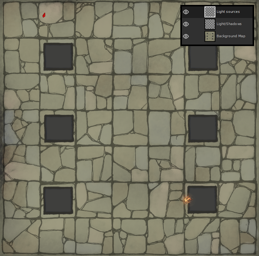
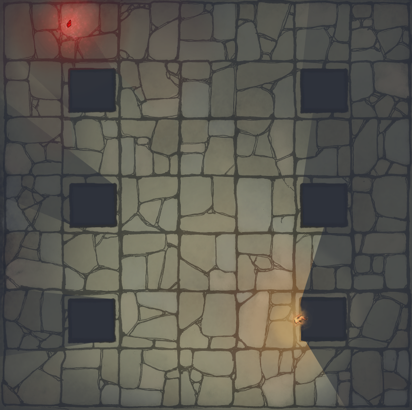
Here is a generic map that we would like to enhance.
You can notice some points of interest on the map:
As it is the map is quite uninteresting to look at, but hopefully we will change that.
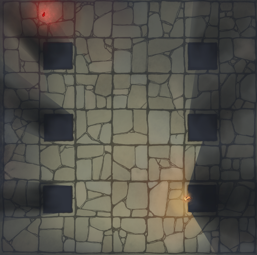
Side note: I’ve placed a light window to show you how my layers are organised in top right corner, the only important thing to note is that the light source are above the light/shadow layer so that they aren’t obscured by the colours we will put later on. You can do it differently of course if you want to.
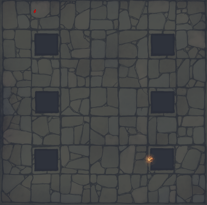
Step 1 – Adding the shadow
I apply a dark blue color to my light/shadow layer.
Colour used #292E3A
Opacity 80%
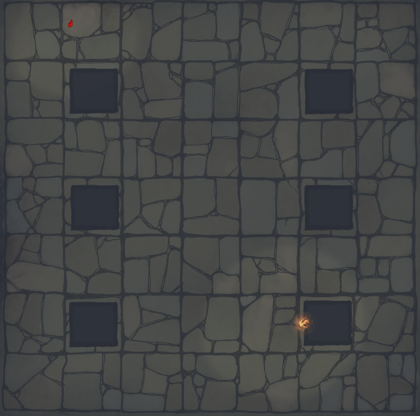
Step 2 – Erasing the shadows
At this stage, I erase the shadows around the light sources and try to keep in mind the way light travels.
Use the eraser and take your time:
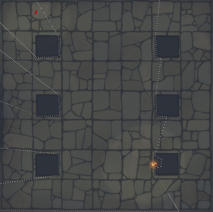
First I slightly define the light area around the light source.
To make it easier to define the way the light travel, especially for a bright light like the torch, I used the lasso tool to create a selection of my “light-able” area (where the light might go), see below:
Then I gradually erase my shadows.

You should arrive at something like this:

Note that I choose to make the light area really small for the gem, as it is not shining super duper bright.
Step 3 – Adding some colour
At this step I add some colour around my light source, go light on the opacity.
For the gem I used these shades of red:
#e21414 (wide area) #ff9393 (near the gem)
For the torch, I did it in three time using these colours:
#ed7b3f (wide) #f8c046 (closer) #f8d589 (closest)
The opacity was set to around 7% (I used the aerograph tool)

This guy
Step 4 – Deepening the shadows
If you already here, your map should already look pretty good at this point. This step and the next are just the cherry on top.
I used the aerograph with a blue that was darker than the one used previously and started to gradually add some deeper shadows where it made sense. Try to keep in mind that shadows are pretty dark away from a light source but also close to it (not gonna get into the physics of why, but it has to do with light radiation, etc.).
Anyway, in practice you get something like this:
Note that you don’t have to go as heavy handed as I did, again whatever suit your personal taste.

Step 5 – Blurring the shadows
If you look at our map, you’ll see that the shadows of our pillars are pretty straight, but in real life the further you are from a light source the blurrier the shadows get (again physics and stuff). For this step, I use the smudge tool to blur the shadows a bit as they go further away from a pillar.

The smudge tool is this guy
THE END
Congratulations! You’ve made it all the way to the end.
Now you just have to practice, try some stuff and figure out what works or not for you.
Written by The Kobold DM, Benjamin Mouginot (u/MassiveGreenGorrila)
If you would like to design your own dungeon map you can find some hand-picked downloads below:


Explore more content like this on our Community Gallery:
Or explore articles from across the site:
If you have your own photos you would like to share, please reach out to me! You can email me at 2minutetabletop {at} gmail {dot} com, or you can find me on social media:

About the author
Leave a Comment
Related Posts


Notifications
